
Ok... this is my first full-length text file,
so I dont know how its goingto turn out...
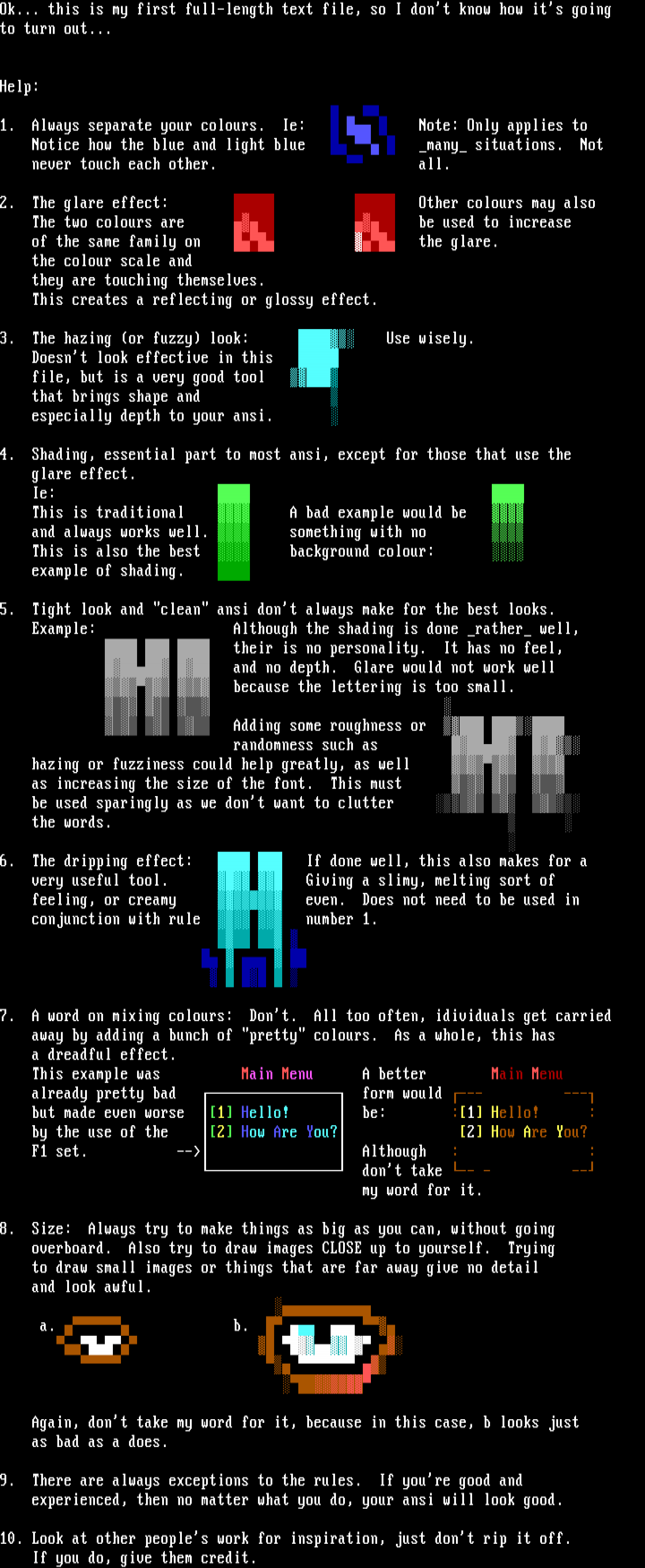
Help: 1. Always separat
e your colours. Ie: Note
: Only applies to Notice how the blue and light blue
many situations. Not
never touch each other. all.
2. The glare effect:
Other colours may also The t
wo colours are
be used to increase of the same fam
ily on the glar
e. the colour scale and they are touching t
hemselves. This creates a reflecting or glossy effect
.3. The hazing or fuzzy look:
Use wisely. Doesnt look effective in this
file, but is a very good tool
that brings shape and
especially depth to your ansi.
4. Shading, essential part to mos
t ansi, except for those that use the glare effect.
Ie:
This is traditional A bad exam
ple would be
and always works well. something
with no
This is also the best background
colour:
example of shading.
5. Tight look and clean ansi dont always make for the best loo
ks.
Example: Although the shading is done rather well,
their is no personality. It has no f
eel,
and no depth. Glare would not work well
because the
lettering is too small.
Adding some roughnes
s or
randomness such as
hazing or fuzziness could help greatly, as well
as increasing the size of the font. This must
be used sparingly as we dont want to clutter
the words.
6. The dripping effect:
If done well, this also makes for a
very useful tool. Giving a s
limy, melting sort of
feeling, or creamy even. Does
not need to be used in
conjunction with rule number 1
7. A word on mixing colours: Dont. All too often, idivi
duals get carried
away by adding a bunch of pretty colours. As a whole, this
has
a dreadful effect.
This example was Main Menu A b
etter Main Menu
already pretty bad form would
but made even worse 1 Hell
o! be: :1 Hello!
by the use of the 2 How
Are You? 2 H
ow Are You?
F1 set. -- Although : :
dont take -- - --
my word for it.
8. Size: Always try to make things as big as you can, without go
ing
overboard. Also try to draw images CLOSE up to yourself. Try
ing
to draw small images or things that are far away give no detai
l
and look awful.
a. b.
Again, dont take my word for it, because in this case, b
looks just
as bad as a does.
9. There are always exceptions to the rules. If youre good and
experienced, then no matter what you do, your ansi will look g
ood.
10. Look at other peoples work for inspiration, just dont rip it
off.
If you do, give them credit.
so I dont know how its goingto turn out...
Help: 1. Always separat
e your colours. Ie: Note
: Only applies to Notice how the blue and light blue
many situations. Not
never touch each other. all.
2. The glare effect:
Other colours may also The t
wo colours are
be used to increase of the same fam
ily on the glar
e. the colour scale and they are touching t
hemselves. This creates a reflecting or glossy effect
.3. The hazing or fuzzy look:
Use wisely. Doesnt look effective in this
file, but is a very good tool
that brings shape and
especially depth to your ansi.
4. Shading, essential part to mos
t ansi, except for those that use the glare effect.
Ie:
This is traditional A bad exam
ple would be
and always works well. something
with no
This is also the best background
colour:
example of shading.
5. Tight look and clean ansi dont always make for the best loo
ks.
Example: Although the shading is done rather well,
their is no personality. It has no f
eel,
and no depth. Glare would not work well
because the
lettering is too small.
Adding some roughnes
s or
randomness such as
hazing or fuzziness could help greatly, as well
as increasing the size of the font. This must
be used sparingly as we dont want to clutter
the words.
6. The dripping effect:
If done well, this also makes for a
very useful tool. Giving a s
limy, melting sort of
feeling, or creamy even. Does
not need to be used in
conjunction with rule number 1
7. A word on mixing colours: Dont. All too often, idivi
duals get carried
away by adding a bunch of pretty colours. As a whole, this
has
a dreadful effect.
This example was Main Menu A b
etter Main Menu
already pretty bad form would
but made even worse 1 Hell
o! be: :1 Hello!
by the use of the 2 How
Are You? 2 H
ow Are You?
F1 set. -- Although : :
dont take -- - --
my word for it.
8. Size: Always try to make things as big as you can, without go
ing
overboard. Also try to draw images CLOSE up to yourself. Try
ing
to draw small images or things that are far away give no detai
l
and look awful.
a. b.
Again, dont take my word for it, because in this case, b
looks just
as bad as a does.
9. There are always exceptions to the rules. If youre good and
experienced, then no matter what you do, your ansi will look g
ood.
10. Look at other peoples work for inspiration, just dont rip it
off.
If you do, give them credit.

log in to add a comment.