this image contains text
heres a really cheap and dirty way to do fonts. this is for beginners and
intermediate artists. i did this because i had just finished a pic and didnt
feel like spending time on the font.
,gp, ,gp, ,gp, ,gp, ,gp, ,gp,
d.d.d.d.d.d.
47 47 47 47 47 47
*4* *4* *4* *4* *4* *4*
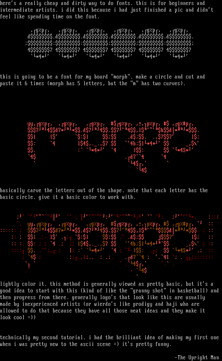
this is going to be a font for my board morph. make a circle and cut and
paste it 6 times morph has 5 letters, but the m has two curves.
yy,gp, ,gp, ,gp, gp, ,,pp, ,gp,
74d7**.d74.74,lbd**.
l l :l .d. .,77 l
: 4 l4,..,7 4bl*4* ,
. : *4* 4 : *4S*
4 .d74 4
4,
4
basically carve the letters out of the shape. note that each letter has the
basic circle. give it a basic color to work with.
. yy,gp, ,gp, ,gp, gp, ,,pp, ,gp, ::
:::::: 74d7**.d74.74,ld**. ::
:: l .: l . :l . .d j7 l ::
:: :. : 4 . l4,..,7 4bl*4* , ::
:::: . ., l : *4* 4 : . *4S* . ::
4 .,l.. .. .d74 .4l . :::::
.4, . .
. 4
lightly color it. this method is generally viewed as pretty basic, but its a
good idea to start with this kind of like the granny shot in basketball and
then progress from there. generally logos that look like this are usually
made by inexperienced artists or wierdos like prodigy and haji who are
allowed to do that because they have all those neat ideas and they make it
look cool
technically my second tutorial. i had the brilliant idea of making my first one
when i was pretty new to the ascii scene its pretty funny.
-The Upright Man

log in to add a comment.