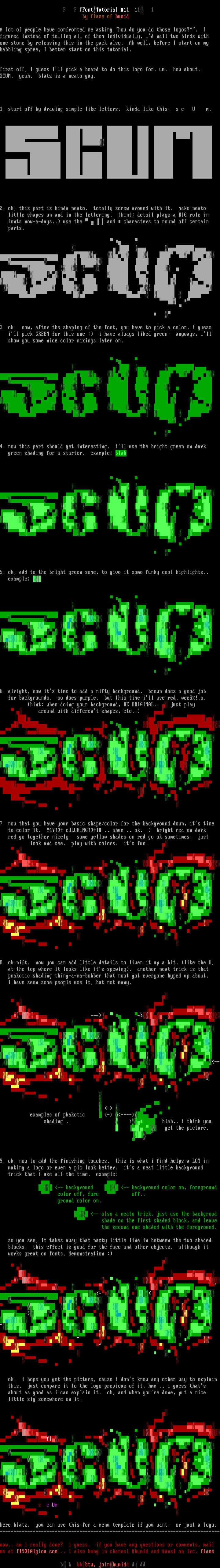
F F FFontTutorial 11 11 1
by flame of humid
A lot of people have confronted me asking how do you do those logos?!. I
figured instead of telling all of them individually, Id nail two birds with
one stone by releasing this in the pack also. Ah well, before I start on my
babbling spree, I better start on this tutorial.
first off, i guess ill pick a board to do this logo for. um.. how about..
SCUM. yeah. blatz is a neato guy.
1. start off by drawing simple-like letters. kinda like this. s c U m.
2. ok, this part is kinda neato. totally screw around with it. make neato
little shapes on and in the lettering. hint detail plays a BIG role in
fonts now-a-days.. use the and characters to round off certain
parts.
3. ok. now, after the shaping of the font, you have to pick a color. i guess
ill pick GREEN for this one : i have always liked green. anyways, ill
show you some nice color mixings later on.
4. now this part should get interesting. ill use the bright green on dark
green shading for a starter. example blah
5. ok, add to the bright green some, to give it some funky cool highlights..
example
6. alright, now its time to add a nifty background. brown does a good job
for backgrounds. so does purple. but this time ill use red. wee!.a.
hint: when doing your background, BE ORIGINAL.. just play
around with different shapes, etc..
7. now that you have your basic shape/color for the background down, its time
to color it. Y4Y!@ cOLORING!@! .. ahum .. ok. : bright red on dark
red go together nicely. some yellow shades on red go ok sometimes. just
look and see. play with colors. its fun.
8. ok nift. now you can add little details to liven it up a bit. like the U,
at the top where it looks like its spewing. another neat trick is that
pnakotic shading thing-a-ma-bobber that noot got everyone hyped up about.
i have seen some people use it, but not many.
examples of pkakotic - ----
shading .. blah.. i think you
get the picture.
9. ok, now to add the finishing touches. this is what i find helps a LOT in
making a logo or even a pic look better. its a neat little background
trick that i use all the time. example:
-- background -- background color on, foreground
color off, fore off..
ground color on.
-- also a neato trick. just use the backgroud
shade on the first shaded block, and leave
the second one shaded with the foreground.
so you see, it takes away that nasty little line in between the two shaded
blocks. this effect is good for the face and other objects. although it
works great on fonts. demonstration :
ok. i hope you get the picture, cause i dont know any other way to explain
this. just compare it to the logo previous of it. hmm .. i guess thats
about as good as i can explain it. oh, and when youre done, put a nice
little sig somewhere on it.
fl
s c Um
here blatz. you can use this for a menu template if you want. or just a logo. --------------------------------------------------------------------------------
wow.. am i really done? i guess. if you have any questions or comments, mail
me at fl901@iglou.com .. i also hang in channel humid and ansi on irc. flame
b b bbbtw, joinhumidd d dd
FILE
PREVIEW
SAUCE
- title
- font tutorial #1
- author
- flame
- group
- hUMID
- date
- 1996-04-20
- comments
- datatype
- character
- filetype
- ansi
- filetype info
-
width: 80
height: 237
font:
icecolors: no
letter spacing: not specified
legacy aspect: not specified
META - TAGS
- artist(s)
- group(s)
- content
copy tags navigation report a problem
log in to add a comment.