SAUCE ANSI flags
ANSI flags as used in SAUCE metadata are very usefule to render correctly ANSI and ASCII textmode art as not every text console is identical.
Legacy aspect ratio
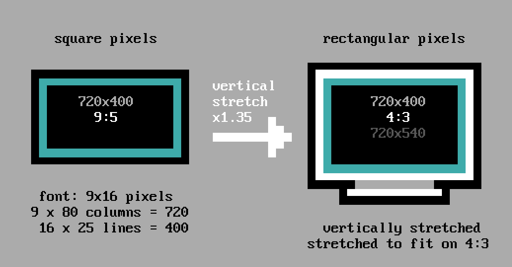
"nobody said pixels were square."
As opposed to modern display devices, early display hardware did not use square pixels and this affects how we are looking at ASCII/ANSI art today. In the nineties IBM monitors supported diferent video modes for text mode and VGa display. The text mode used a 720x400 pixel resolution. The fixed-width text font used in MS DOS was 16 pixels tall and 9 pixel wide (the last column being spacing, see next section) on screens of 80 columns wide and 25 lines long which fits the resolution mentioned earlier: 9 pixels wide * 80 columns = 720 pixels for the screen width and 16 pixels tall * 25 lines = 400 pixel for the screen height.
If we now assume that pixels are square, and we know CRT screens typically have an aspect ratio of 4:3, something is not right as 720x400 fits an aspect ratio of 9:5. The illustration below indicates what a 9:5 aspect ratio would look like (on the left) and on the right a 4:3 aspect ratio screen as we know it.
To use the entire screen, the output in text mode was 'stretched' by 35% through using rectangular pixels as this fits on a 4:3 screen. The equivalent of this video output when using square pixels would be a resolution 720x540.
Letter spacing (8/9px font)
A character in MS-DOS has always been 8 pixels wide. But the spacing between letters used to be part of the font bitmap in textmode. For VGA the full width of 8 pixels could be used for the font as the 1 pixel spacing was inserted by the VGA hardware. As this was causing an interruption for line characters which needed to connect, the 8th column was duplicated instead of empty spacing for some characters, this includes the line drawing characters (└─┬─┼┤ ═╦╩) and also the full block (█) and so-call 'halfblocks' (▀▄▌▐)
The 'shade blocks' (░▒▓) however were not part of this exception and this caused a more visible 'break' between those characters, especially when placed next together. The image below is an enlarge view of these shade blocks which shows the difference in characters
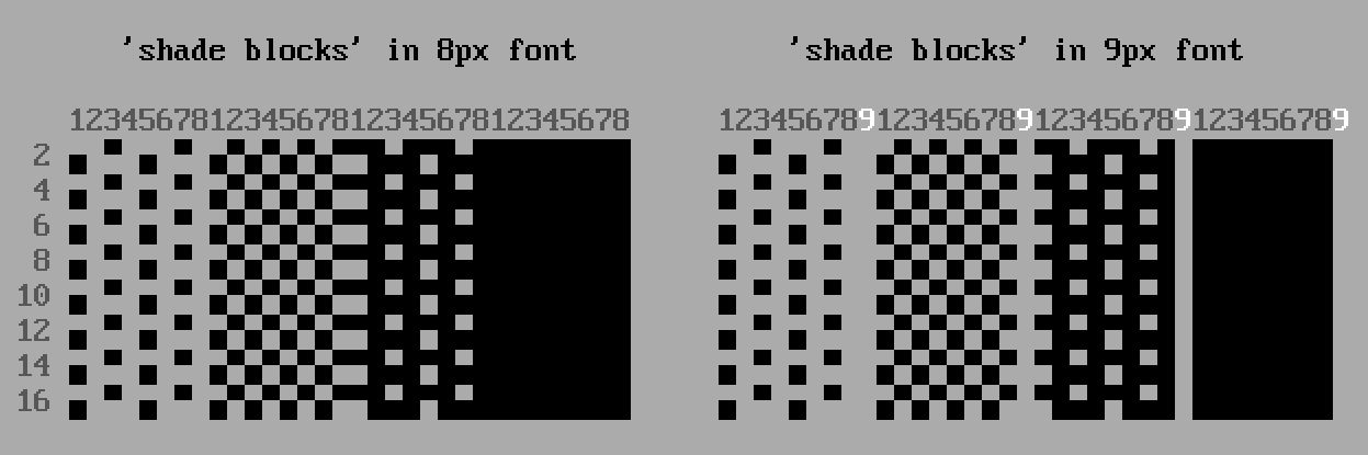
When these 'shade blocks' are used within ANSI art the difference between 8px (no shade block spacing) or 9px (with shade block spacing) there is a difference on in display and width:
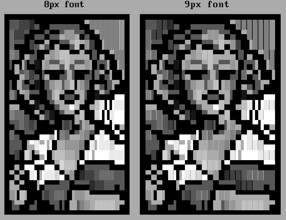
The image above intends to depict the difference between 8 and 9px font, but technically the 9px font was always used in combination with legacy aspect (see above): one extra pixel in 80 colums means the horizontal resolution increases from 640 to 720. To match the original aspect ratio, the output should also be vertically stretched.
While 'modern' editors such as PabloDraw will allow for making any combination of letter spacing and aspect ratio, the only combinations that were technically used were legacy aspect + 9px font and non legacy aspect + 8px font. Any other combination is 'artistic freedom'.
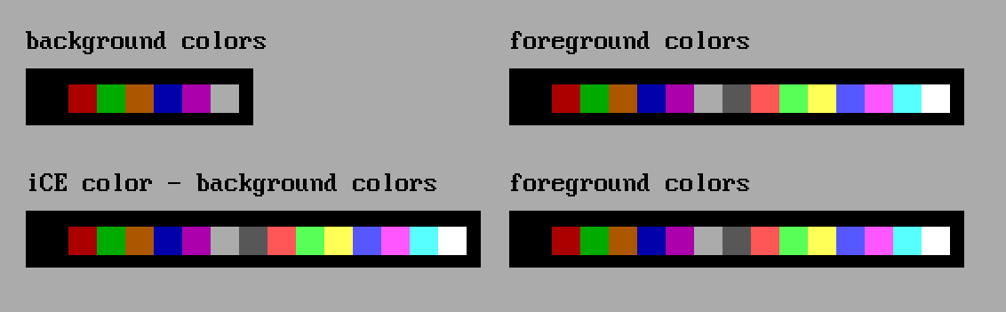
iCE colors
The ANSI specification has 16 foreground colors and 8 background colors. As shown below only the darker colors can be used as background colors. The specification also allowed for blinking characters and this bit was used to replace the blinking feature with the extra background colors. Using iCE colors in a viewer, client, editor, ... that doesn't support it would therefor result in blinking characters.