
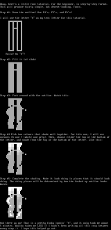
Okay, heres a little font tutorial, for the beginner,
in step-by-step format.
This will produce fairly simple, but decent-looking, fo
nts.
Step 1: Draw the outline! Use F4s, F5s, and F6s!
I will use the letter A as my test letter for this tu
torial.
Voila! An A!
Step 2: Fill it in! duh
Step 3: Fuck around with the outline. Watch this:
Step 4 Pick two colours that shade well together. For
this one, I will use
colours 15 and 7 white and grey. Then, choose either
the top or the bottom of
the letter, and shade from the top or the bottom of the
letter. Like this:
Step 5: Complete the shading. Make it look shiny in pl
aces that it should look
shiny. The shiny places will be determined by how the f
ucked up outline looks.
Watch:
And there ya go! That is a pretty funky lookin A, an
d it only took me about
5 minutes. Woulda taken me LESS if I hadnt been writin
g all this crap between
every step . I hope this helped ya out.
FILE
PREVIEW
SAUCE
- title
- logo tutorial
- author
- c0unt zer0
- group
- TWiSTED
- date
- 1980-05-01
- comments
- datatype
- character
- filetype
- ansi
- filetype info
-
width: 80
height: 83
font:
icecolors: no
letter spacing: not specified
legacy aspect: not specified
META - TAGS
- artist(s)
- group(s)
- content
copy tags navigation report a problem
log in to add a comment.