
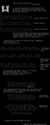
Small essay on oldschool ascii
by Yce!tUs!A
I really dont know whats the ideal oldschool ascii
the shapy one, the spiky one, or the one that u can
actually read. Whatever the case might be here i leave
some of them for u to see.
// / // / Regular oldschool ascii
- / / / / / . / Straight Inversion
. / / - / Inverted with tweaks
This ive just discovered, just by selecting and inverting
a regular font the spiky effect apears. Obviously Not the
same fonts appear A transfor into R. And so on,
tweaks are done on B to I and on most,
I guess thats just a phase, but more can be done, decomposing
may be the thing. :P
Lets do some on the C line
. / / / Left Displace
// / / // / of the upper
part.
Right Displace
Of the upper
part
. Right Displace
/ / / // / / /-- / Of the right
/ / part of each
font.
And some
A lot more can be done here, i guess this is the part
that determinates the style your ascii.
Altho this is unreadable, its a cool shape to
work out. Lets see what we can do.
/ /i / / - /-- /
RXaRb :P
Still unrecognizable but then again, isnt that supossed to be
good oldschool ascii?. I really dont know, because i havent
done much of this style anyways.
. Some tweaking
/ /i / / - /-- / Added some base
. / / / Tweaking plus
/ / / / // / Shaping Fonts
t u s ! a
U s u a l S u s p e c t s
I apologize for the bad grammar and typos.
Comments, etc, yce@liquidgravity.net
log in to add a comment.