
GUn
H O W T O D R A W L O G O S T H E G U N T
H A R W A Y
GUn
-- alright this is a logo tutoria
l that was originally started for a friend of
-- mine who wanted some tips on how to improve his logo..
so he asked me to
-- go and do this for him and i said why the heck not..?
ive released one
-- other logo tutorial before which i thought stunk but ap
parently not the 3
-- ppl that ripped it so im planning on making this one qu
ite a bit better..
-- gunthar : illness pres : awe lettering : golden bees : la
ctose council :
GUn
d
o i
n k
can you say
doink?
sC!
SomniacBURN
sC! d
sC!
som
o
som
som
i
n
k
sC
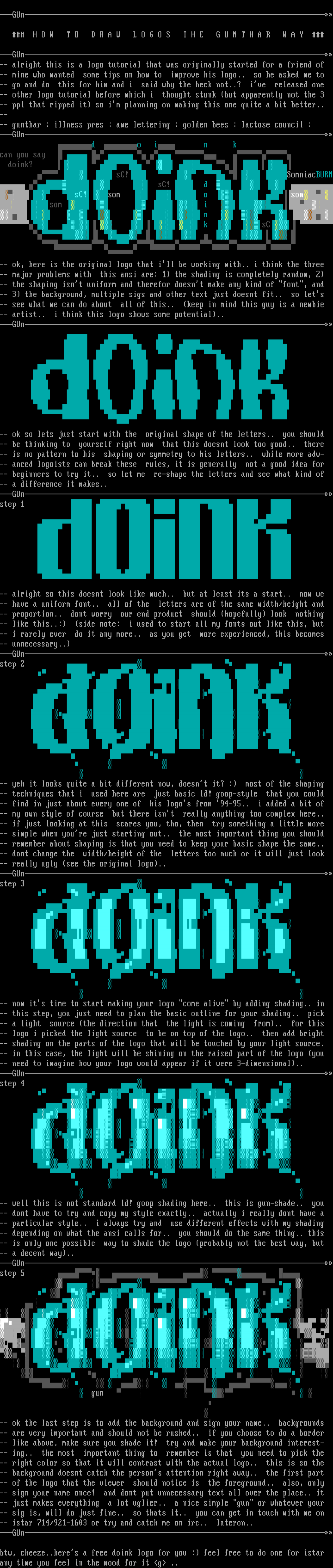
-- ok, here is the original logo that ill be working with..
i think the three
-- major problems with this ansi are: 1 the shading is com
pletely random, 2
-- the shaping isnt uniform and therefor doesnt make any k
ind of font, and
-- 3 the background, multiple sigs and other text just does
nt fit.. so lets
-- see what we can do about all of this.. keep in mind th
is guy is a newbie
-- artist.. i think this logo shows some potential..
GUn
-- ok so lets just start with the original shape of the let
ters.. you should
-- be thinking to yourself right now that this doesnt look
too good.. there
-- is no pattern to his shaping or symmetry to his letters.
. while more adv-
-- anced logoists can break these rules, it is generally n
ot a good idea for
-- beginners to try it.. so let me re-shape the letters an
d see what kind of
-- a difference it makes..
GUn
step 1
-- alright so this doesnt look like much.. but at least its
a start.. now we
-- have a uniform font.. all of the letters are of the sam
e width/height and
-- proportion.. dont worry our end product should hopefu
lly look nothing
-- like this..: side note: i used to start all my fonts
out like this, but
-- i rarely ever do it any more.. as you get more experie
nced, this becomes
-- unnecessary..
GUn
step 2
-- yeh it looks quite a bit different now, doesnt it? : m
ost of the shaping
-- techniques that i used here are just basic ld! goop-sty
le that you could
-- find in just about every one of his logos from 94-95..
i added a bit of
-- my own style of course but there isnt really anything
too complex here..
-- if just looking at this scares you, tho, then try somet
hing a little more
-- simple when youre just starting out.. the most importan
t thing you should
-- remember about shaping is that you need to keep your basi
c shape the same..
-- dont change the width/height of the letters too much or
it will just look
-- really ugly see the original logo..
GUn
step 3
-- now its time to start making your logo come alive by a
dding shading.. in
-- this step, you just need to plan the basic outline for yo
ur shading.. pick
-- a light source the direction that the light is coming
from.. for this
-- logo i picked the light source to be on top of the logo.
. then add bright
-- shading on the parts of the logo that will be touched by
your light source.
-- in this case, the light will be shining on the raised par
t of the logo you
-- need to imagine how your logo would appear if it were 3-d
imensional..
GUn
step 4
-- well this is not standard ld! goop shading here.. this i
s gun-shade.. you
-- dont have to try and copy my style exactly.. actually i
really dont have a
-- particular style.. i always try and use different effec
ts with my shading
-- depending on what the ansi calls for.. you should do the
same thing.. this
-- is only one possible way to shade the logo probably not
the best way, but
-- a decent way..
GUn
step 5
gun
-- ok the last step is to add the background and sign your n
ame.. backgrounds
-- are very important and should not be rushed.. if you cho
ose to do a border
-- like above, make sure you shade it! try and make your ba
ckground interest-
-- ing.. the most important thing to remember is that yo
u need to pick the
-- right color so that it will contrast with the actual logo
.. this is so the
-- background doesnt catch the persons attention right away
.. the first part
-- of the logo that the viewer should notice is the foregr
ound.. also, only
-- sign your name once! and dont put unnecessary text all o
ver the place.. it
-- just makes everything a lot uglier.. a nice simple gun
or whatever your
-- sig is, will do just fine.. so thats it.. you can get i
n touch with me on
-- istar 714/921-1603 or try and catch me on irc.. lateron.
GUn
btw, cheeze..heres a free doink logo for you : feel free t
o do one for istar
any time you feel in the mood for it g ..
H O W T O D R A W L O G O S T H E G U N T
H A R W A Y
GUn
-- alright this is a logo tutoria
l that was originally started for a friend of
-- mine who wanted some tips on how to improve his logo..
so he asked me to
-- go and do this for him and i said why the heck not..?
ive released one
-- other logo tutorial before which i thought stunk but ap
parently not the 3
-- ppl that ripped it so im planning on making this one qu
ite a bit better..
-- gunthar : illness pres : awe lettering : golden bees : la
ctose council :
GUn
d
o i
n k
can you say
doink?
sC!
SomniacBURN
sC! d
sC!
som
o
som
som
i
n
k
sC
-- ok, here is the original logo that ill be working with..
i think the three
-- major problems with this ansi are: 1 the shading is com
pletely random, 2
-- the shaping isnt uniform and therefor doesnt make any k
ind of font, and
-- 3 the background, multiple sigs and other text just does
nt fit.. so lets
-- see what we can do about all of this.. keep in mind th
is guy is a newbie
-- artist.. i think this logo shows some potential..
GUn
-- ok so lets just start with the original shape of the let
ters.. you should
-- be thinking to yourself right now that this doesnt look
too good.. there
-- is no pattern to his shaping or symmetry to his letters.
. while more adv-
-- anced logoists can break these rules, it is generally n
ot a good idea for
-- beginners to try it.. so let me re-shape the letters an
d see what kind of
-- a difference it makes..
GUn
step 1
-- alright so this doesnt look like much.. but at least its
a start.. now we
-- have a uniform font.. all of the letters are of the sam
e width/height and
-- proportion.. dont worry our end product should hopefu
lly look nothing
-- like this..: side note: i used to start all my fonts
out like this, but
-- i rarely ever do it any more.. as you get more experie
nced, this becomes
-- unnecessary..
GUn
step 2
-- yeh it looks quite a bit different now, doesnt it? : m
ost of the shaping
-- techniques that i used here are just basic ld! goop-sty
le that you could
-- find in just about every one of his logos from 94-95..
i added a bit of
-- my own style of course but there isnt really anything
too complex here..
-- if just looking at this scares you, tho, then try somet
hing a little more
-- simple when youre just starting out.. the most importan
t thing you should
-- remember about shaping is that you need to keep your basi
c shape the same..
-- dont change the width/height of the letters too much or
it will just look
-- really ugly see the original logo..
GUn
step 3
-- now its time to start making your logo come alive by a
dding shading.. in
-- this step, you just need to plan the basic outline for yo
ur shading.. pick
-- a light source the direction that the light is coming
from.. for this
-- logo i picked the light source to be on top of the logo.
. then add bright
-- shading on the parts of the logo that will be touched by
your light source.
-- in this case, the light will be shining on the raised par
t of the logo you
-- need to imagine how your logo would appear if it were 3-d
imensional..
GUn
step 4
-- well this is not standard ld! goop shading here.. this i
s gun-shade.. you
-- dont have to try and copy my style exactly.. actually i
really dont have a
-- particular style.. i always try and use different effec
ts with my shading
-- depending on what the ansi calls for.. you should do the
same thing.. this
-- is only one possible way to shade the logo probably not
the best way, but
-- a decent way..
GUn
step 5
gun
-- ok the last step is to add the background and sign your n
ame.. backgrounds
-- are very important and should not be rushed.. if you cho
ose to do a border
-- like above, make sure you shade it! try and make your ba
ckground interest-
-- ing.. the most important thing to remember is that yo
u need to pick the
-- right color so that it will contrast with the actual logo
.. this is so the
-- background doesnt catch the persons attention right away
.. the first part
-- of the logo that the viewer should notice is the foregr
ound.. also, only
-- sign your name once! and dont put unnecessary text all o
ver the place.. it
-- just makes everything a lot uglier.. a nice simple gun
or whatever your
-- sig is, will do just fine.. so thats it.. you can get i
n touch with me on
-- istar 714/921-1603 or try and catch me on irc.. lateron.
GUn
btw, cheeze..heres a free doink logo for you : feel free t
o do one for istar
any time you feel in the mood for it g ..
FILE
PREVIEW
SAUCE
- title
- How to draw logos the Gunthar way
- author
- Gunthar
- group
- Fire
- date
- 1997-01-30
- comments
- datatype
- character
- filetype
- ansi
- filetype info
-
width: 80
height: 25
font:
icecolors: no
letter spacing: not specified
legacy aspect: not specified
META - TAGS
- artist(s)
- group(s)
- content
copy tags navigation report a problem
log in to add a comment.